A badly designed restaurant can ruin appetites.
Which is why restaurant owners should pay special attention to these tips from Dale Atkinson, founder of London-based interior architecture studio , which has been commissioned to work on three new restaurants for Michelin-starred chef .
Here Dale reveals the common mistakes in restaurant design, the key signs you’re in a well-thought-out eaterie – and why owners need to pay special attention to the look of the toilets.
What are the common mistakes you see in restaurant design?
Dale told MailOnline Travel: ‘The first mistake I always see in restaurants that are poorly designed is the lighting.
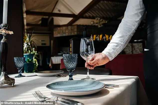
‘Sometimes there are far too many downlights and you get a “flat lit” room. Well-lit rooms are usually warm and inviting, and the lighting is achieved by layering.
‘One especially annoying thing is when you have nice ambient lighting that is destroyed as open and cool light flashes into the room every time servicing goes in and out.
‘Another aspect of a poorly designed dining space is when the tables are crammed in and there is no space and you are essentially sitting with the table next to you.
‘You can hear each other’s conversations, which is off-putting.
‘Lastly, is when the furniture is uncomfortable and uses poor ergonomics. This is most frequently seen in banquette seating, where there’s nothing worse than a thinly padded seat and a completely vertically straight backrest. ‘
What are the key signs of a well-thought-out restaurant?
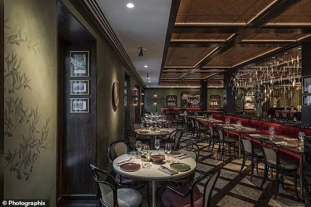
Dale told MailOnline: ‘A well-lit room can take a restaurant far. A lighting installation that is layered and has key feature callouts can help root a design, such as in Rue Du Liban, Mumbai (pictured).
‘Obviously lighting alone cannot do everything, but it is one of the most important aspects of any room.
‘Consider this, you are in a white box room and you have a series of fluorescent lights on the ceiling. This room would be flatly lit and very bright.
‘However, if you take the same room and simply place a candle in the middle, all of a sudden this room dims down and becomes very romantic.
‘Acoustics are also important, if you go into a room and you cannot hear your own conversation then this can ruin your evening.
‘A lot of soft furnishings and details can help stifle echo and help produce a lovely ambience whilst also providing a comfortable space.
Keeping a few spaces out of sight also helps.
Dale explained: ‘A key aspect of a well-designed restaurant is when not all areas are displayed straightaway, and the designers create a journey where the space opens itself up. This helps the restaurant in that when diners return, they don’t always have the same experience as they might sit in a different area.
‘One aspect of the journey one always experiences in a restaurant are the toilets, yet surprisingly, these are frequently overlooked, or undervalued. But they are one of the most important spaces in a restaurant.
‘You know when you are in a well-designed restaurant when the toilets are as impressive as the main dining room.
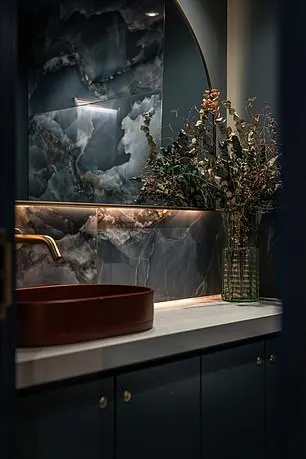
‘One of my favourite toilets I designed was at Mallow (pictured), in London’s Canary Wharf. We used colour to bring them to life.’
How important is the entrance and what can a restaurant do to make it welcoming?
Dale said: ‘I once had a discussion with a Michelin inspector and they made a very interesting comment that stuck with me ever since, “A consumer’s first bite is always taken with their eyes.”
‘Much like the old adage, “You never have a second chance at a first impression.” So, the entrance is really one of the most important parts of a customer’s journey. If you’re unable to capture their imagination or interest at this point you are fighting an uphill battle from here on in.’
Dale urges restaurant owners to think about installing a feature installation at the entrance, something that guests would photograph and post on social media.
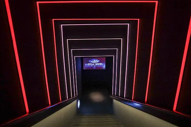
He continued: ‘A great example of a feature at the entrance that really captures people’s interest is the light tunnel we created for KingsSocial, at the storied Badrutts Palace, in St Moritz. Here, upon entering, the first experience of the space is a long staircase that takes one to the main room. To make this journey memorable, we introduced arches of colour-changing LEDs leading down the stairs. This was an Instagrammable feature and very popular. It is frequently spoken of and mentioned in various social media.’
How could a restaurant improve its design on a budget?
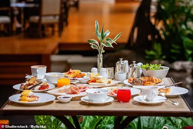
Dale said: ‘One of the best things to do when redesigning a restaurant on a budget is to try and utilise as much of what is existing, but superficially change it. This could be keeping some existing timber panelling or flooring and sanding it back and re-staining it. It could be retaining some flat-leaf doors and simply applying some moulding to them to give them some visual interest.’
Designwise, where should an owner put his or her money?
Dale said: ‘A good rule of thumb for where to spend the money on any project is on the main touch points.
‘This means where the consumers are most likely to interact with the most. For example, every customer is going to touch and interact with the dining table, so if you install a cheap melamine tabletop with plywood substrate and you can see the layers of plywood on the table edge, customers are going to know this and see that it is cheap.’
Are there any design elements you see in restaurants that readers could incorporate into their homes?
Dale revealed: ‘I think there are a lot of crossovers that can work in both residential and in restaurants. In one of our residential projects we employed curved booth seating in the kitchen to create some soft seating where the family could sprawl out and relax, as they saw the kitchen as the central hub where the family would all congregate most of the time.
‘Again, lighting can play an important role and many of the lighting details that we employ in restaurants can be used in the home to create features in either the dining room or kitchen. Of course, it could quite simply be a feature pendant above a dining table. This is as equally important in restaurant design as it is in our residential projects.
‘Lastly, one design aspect that we frequently take from restaurant design and use in residential design is making a feature out of glassware storage or a liquor cabinet – and even a feature wine cellar can be a great feature and talking point in any home when entertaining guests.’
For more from Rosendale Design visit .

